Monday, 27 July 2020

Share Custom labels between Lightning Web Components

We know how to use custom label in lightning web components. What about if you have large list of labels and you want to to use in multiple LWC components? In this post we will talk about best practice to import bulk custom label in LWC and how to create utility class to import same set of label in multiple Lightning web components.

You can create a utility component that imports all the labels and then exposes them bundled together in one object via a method. Then your main component will have a cleaner list of imports.

Step 1) Create Utility Class.


Create a Lightning web component that contains only a single Js file. Like below structure

labelUtility
   ├──labelUtility.js
   └──labelUtility.js-meta.xml

Lets create one common label Utility component.

labelUtility.js
import header from '@salesforce/label/c.Header';
import title from '@salesforce/label/c.title';

const label = {
    header: header,
    title: title
};

export {label};
  • The module should only have a JS file & Metadata file in it, otherwise it will not work.
  • Just like with any Lightning web component, the folder name and the filename must be identical
  • Imports all the labels and then exposes them bundled together with export.

Step 2) How to use shared label Utility


Create new Lightning web component and import Js file with import statement like below

import { label  } from 'c/labelUtility';

Let see the full code.

import { LightningElement,track } from 'lwc';
import { label  } from 'c/labelUtility';
export default class CustomLabelDemo extends LightningElement {
    @track myLabel=label;
}     
  • Import JS file with import

<template>
    <lightning-card  title={myLabel.title} variant="narrow" icon-name="standard:opportunity">
        <p>{myLabel.header}</p>
    </lightning-card>
</template>   


Please share your feedback and comment if there is any better way to implement or your like this post.



Tuesday, 21 July 2020

Custom Label in Lightning Web Components (LWC)

In this post we will talk about how to use custom label in lightning web components (LWC). Custom labels are text values stored in Salesforce that can be translated into any language that Salesforce supports. We use custom labels to create multilingual applications. Let see how to access custom Label in Lightning Web Components.

To import a label in a Lightning Web Component, use @salesforce/label in an import statement

import labelName from '@salesforce/label/label-reference';
  1. labelName: It is name that refers to the label in LWC.
  2. labelReference: The name of the label in your org.
Custom Labels In Lightning Web Component(LWC) Example

create lightning web component in your sandbox or developer org.

customLabelDemo.html
<template>
    <lightning-card  title={label.title} variant="narrow" icon-name="standard:opportunity">
        <p>{label.header}</p>
    </lightning-card>
</template>
  • To use the labels in the template, use the same {property} syntax that you use to reference any JavaScript property

customLabelDemo.js
import { LightningElement } from 'lwc';
import header from '@salesforce/label/c.Header';
import title from '@salesforce/label/c.Title';
export default class CustomLabelDemo extends LightningElement {

    label = {
        header,
        title
    };
}
  • Use import statement to get the label in Lwc.
  • Then Expose the labels to use in the template using property
customLabelDemo.js-meta.xml
<?xml version="1.0" encoding="UTF-8"?>
<LightningComponentBundle xmlns="http://soap.sforce.com/2006/04/metadata">
    <apiVersion>48.0</apiVersion>
    <isExposed>true</isExposed>
    <targets>
        <target>lightning__AppPage</target>
        <target>lightning__RecordPage</target>
        <target>lightning__HomePage</target>
    </targets>
</LightningComponentBundle>

Result


Monday, 13 July 2020

Code Layout and Formatting

In our last post we talk about Salesforce Naming Conventions Best Practices and this time we will talk about code layout and formatting. A good developer should strive to use a consistent layout and format. It will make the life easy for other developers and code reviewer.

Different teams and projects may have different standards and when contributing to a project, you should follow your team and company standards. I have listed a few guidelines for Salesforce Developer to format the code:-
  • Code Comments Best Practices: When any developer look into your code he should understand what is going in your code easily. Means your code should be "self-documented".
    • Class Level Comment : All Classes and Triggers should begin with a brief comment describing the functional

      /*
      *********************************************************
      Apex Class Name : MyController
      Created Date    : July 12, 2020
      Description        : This is class is used for....
      Created by         : Amit Chaudhary
      Modification Log:
      *********************************************************
      */
    • Method level Comment : All methods must have a @Description section, describing what the method is designed to process. They should have @param section for input  parameters and @return for output.

      /*
      *********************************************************
      @Method Name    : createUser
      @Description    : method to is used to create usser
      @Parameters    :
      @Returns        : Output
      ********************************************************
      */
  • Spaces: White space is commonly used to enhance readability. Here is one example with no spaces.
    Integer i;
    for(i=0;i<10;i++){
        System.debug("Value"+i);
    }
    Now check below code with proper white spaces.

    Integer i;
    for(i=0; i<10; i++){
        System.debug("Value" + i);
    }
  • Blank Lines : Blank lines improve readability by setting off section of code that are logically related.
    • One blank line
      • leave an empty line after a closing function brace
      • between the local variable in a method and its first statement
      • Method definitions within a class are surrounded by a single blank line
      • between logical section inside a method to improve readability
    • Two blank lines
      • Surround function and class definitions with two blank lines
      • Between class and Interface definitions
     
  • Indentation : Use four spaces per indentation level. Usually we use [Tab] key to indent, but most editors can be configured to insert spaces instead of actual tab characters.

    if( age > 24){
        return true;
    } else {
        return false;
    }
  • Wrapping Lines : When an expression will not fit on a single line. Keeping lines to a small width allows scripts to be read in one direction (top to bottom) without scrolling back-and-forth horizontally. Break it according to these general principles
    • Limit lines to 115 characters when possible
    • Break after a comma and before an operator
    • Align the new line with the beginning of the expression at the same level on the previous line.
    • If the above rules lead to confusing code or to code that's squished up against the right margin, just indent spaces instead. 
  • Placement : Put declarations only at the beginning of blocks. (A block is any code surrounded by curly braces "{" and "}".) 
    void myMethod() {
         if (condition) {
         } else {
         }
    }
  • Remove Debug Statements :  Remove debug statements from the code once done with testing.
  • SOQL : Split each logical grouping into it's own line.

    SELECT Id,
           Name
    FROM Account
    WHERE Name like '%ApexHours%'
    LIMIT 10


Feel free to provide more best practices. I would love to add those in this blog post.
.

Wednesday, 1 July 2020

Lazy loading in Lightning Web Component

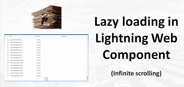
 In this post we will talk about How to implement Infinity or lazy loading in Lightning Web Component using Lightning Datatable. Lazy loading helps you to load the data only when it is required. Infinite scrolling (enable-infinite-loading) enables you to load a subset of data and then load more data when users scroll to the end of the table.

In this post we will learn about lightning datatable attributes enable-infinite-loading and load more offset.
  • enable-infinite-loading : You can load a subset of data and then display more
    when users scroll to the end of the table. Use with the onloadmore event handler to retrieve more data
  • load-more-offset : Determines when to trigger infinite loading based on how many pixels the table's scroll position is from the bottom of the table. The default is 20
  •  onloadmore : The action triggered when infinite loading loads more data
In below image you can check the demo for Lightning Data Table With Lazy Loading. As we load data partially and once the user scrolls down at the end then we load the next set of data. So it is very responsive.


Lets see how we can implement the same.

Step 1) Apex Class with offSet


LazyLoadingController


public with sharing class LazyLoadingController {

    @AuraEnabled(cacheable=true)
    public static List<Account> getAccounts(Integer limitSize, Integer offset){
        List<Account> accountList = [SELECT Id,Name,Rating
                                     FROM Account
                                     ORDER BY CreatedDate
                                     LIMIT :limitSize
                                     OFFSET :offset
                                     ];
        return accountList;
    }
}
We will call same apex class from lightning web component.

Step 2) Lightning web component with Datatable


Create lightning web component in your sandbox or developer org. If you new please check this post how to create lightning web component in non-scratch org.

lazyLoadingLWCDemo.html

<template>
    <div style="height:500px">
    <lightning-datatable key-field="Id"
            data={accounts}
            columns={columns}
            enable-infinite-loading
            onloadmore={loadMoreData}
            hide-checkbox-column="true"
            show-row-number-column="true">
    </lightning-datatable> 
</div>
</template>
To enable infinite scrolling, specify enable-infinite-loading and provide an event handler using onloadmore.


lazyLoadingLWCDemo.js

import { LightningElement, track, wire } from 'lwc';
import getAccounts from '@salesforce/apex/LazyLoadingController.getAccounts';

const columns = [
    { label: 'Id', fieldName: 'Id', type: 'text' },
    { label: 'Name', fieldName: 'Name', type: 'text'},
    { label: 'Rating', fieldName: 'Rating', type: 'text'}
  
];

export default class LazyLoadingLWCDemo extends LightningElement {
    accounts=[];
    error;
    columns = columns;
    rowLimit =25;
    rowOffSet=0;
  
    connectedCallback() {
        this.loadData();
    }

    loadData(){
        return  getAccounts({ limitSize: this.rowLimit , offset : this.rowOffSet })
        .then(result => {
            let updatedRecords = [...this.accounts, ...result];
            this.accounts = updatedRecords;
            this.error = undefined;
        })
        .catch(error => {
            this.error = error;
            this.accounts = undefined;
        });
    }

    loadMoreData(event) {
        const currentRecord = this.accounts;
        const { target } = event;
        target.isLoading = true;

        this.rowOffSet = this.rowOffSet + this.rowLimit;
        this.loadData()
            .then(()=> {
                target.isLoading = false;
            });   
    }


}
We create connectedCallback function to load the initial data and then we are useing loadmoreData function to load more record from Apex base on offset. The onloadmore event handler retrieves more data when you scroll to the bottom of the table until there are no more data to load. To display a spinner while data is being loaded, set the isLoading property to true


lazyLoadingLWCDemo.js-meta.xml
<?xml version="1.0" encoding="UTF-8"?>
<LightningComponentBundle xmlns="http://soap.sforce.com/2006/04/metadata">
    <apiVersion>48.0</apiVersion>
    <isExposed>true</isExposed>
    <targets>
        <target>lightning__AppPage</target>
        <target>lightning__RecordPage</target>
        <target>lightning__HomePage</target>
    </targets>  
</LightningComponentBundle>


Reference blog
  1. Datatable
  2. OffSet

Further Learning
  1. Lightning datatable In Lightning Web Components
  2. Lightning Datatable Sorting in Lightning Web Components


Please share your feedback and let me know if this code can be improve.